
By Richard Humann
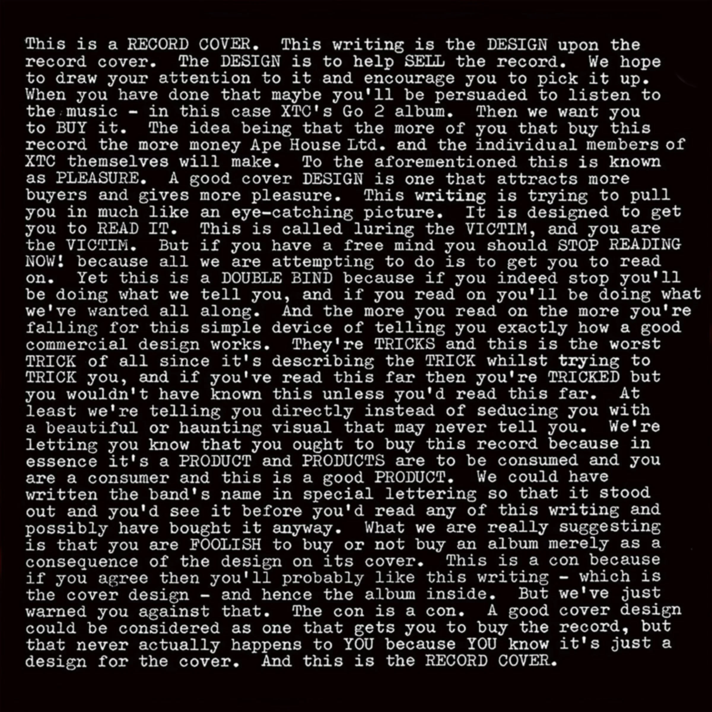
Hipgnosis (Storm Thorgerson and Aubrey Powell), Go 2 (album cover for XTC), 1978.
I’ve always been fascinated by the relationship between what we see and what we hear. A piece of music can bring an image to mind almost immediately, just as an image can summon a song we may not have heard in years. Sometimes the two become so closely connected that it is difficult to separate one from the other. We remember the music through the image, and the image through the music. For me, this is one of the most interesting aspects of the album cover: it is not simply packaging for a recording, but another way of experiencing the music itself.
There was a time when listening to an album was a much more physical experience. You took the record out of its sleeve, placed it on the turntable, lowered the needle, and settled in for the duration. The 12 x 12-inch cover was right there beside you. You studied the artwork, read the credits, turned it over, and sometimes discovered things you hadn’t noticed before. You might spend an entire afternoon with the same record, looking at the same image while hearing the music differently each time. The cover became part of the listening experience.
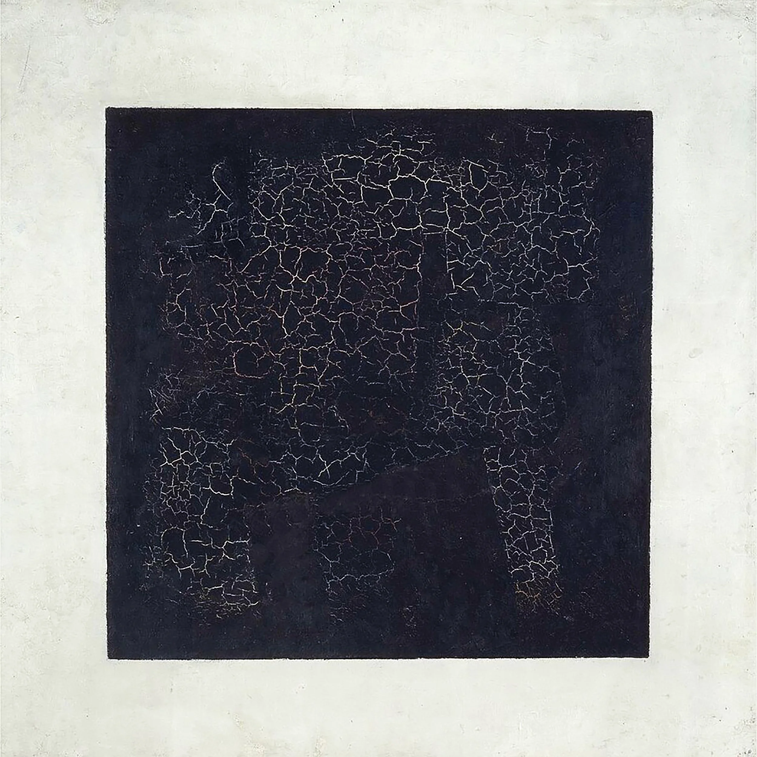
Kazimir Malevich, Black Square, 1915, Oil on linen canvas. 31.3 x 31.3 in.
The square shape itself is where it begins. In 1915, Kazimir Malevich presented Black Square, reducing the visual field to its most basic geometric form. It was a radical proposition, rejecting representation in favor of a different way of thinking about painting. The square became a statement in itself: a boundary, a surface, and a space in which meaning could be concentrated.
Several decades later, Josef Albers began his Homage to the Square series, exploring how colors change in appearance depending on the colors placed beside them. A color can appear warmer, cooler, brighter, or darker simply because of its surroundings. This is the principle of simultaneous contrast, a phenomenon studied long before Albers but central to his exploration of color and perception.
I find that idea particularly interesting when applied to music and visual art. The relationship isn’t identical, of course, but a similar exchange takes place. The image changes the way we approach the sound, and the sound changes the way we interpret the image. Each affects the experience of the other. The album cover becomes a meeting place for two forms of perception.
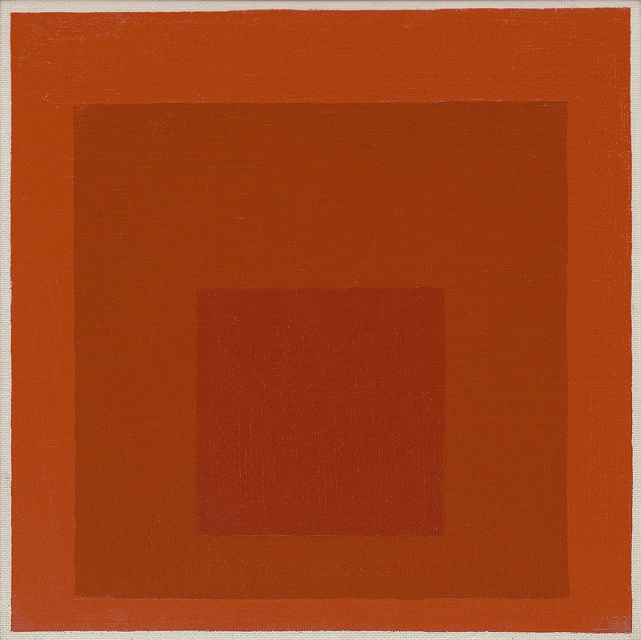
Josef Albers, Homage to the Square, 1968, Oil on masonite, 32 x 32 in.
Before the album cover became an art form in its own right, records were often sold in plain packaging. That changed when Columbia Records hired Alex Steinweiss in 1939. He recognized that the sleeve could do more than protect the disc. It could attract attention, communicate an identity, and give music a visual presence. His illustrated covers helped establish a new language for presenting recorded music, opening the door for designers, photographers, illustrators, and artists.
By the 1950s, the album cover had become an important creative territory. Reid Miles, working with Blue Note Records, developed a visual language as distinctive as the music itself. His designs combined typography, photography, artistic cropping, and carefully considered compositions. A photograph might be enlarged until it became almost abstract; a few words could carry the weight of an entire composition. The covers didn’t simply illustrate the jazz recordings. They established a visual equivalent for them.
The 1960s brought new possibilities. Artists and musicians began working together in ways that blurred the boundaries between popular culture and fine art. Andy Warhol’s involvement with The Velvet Underground is one of the most recognizable examples. The banana on the cover of The Velvet Underground & Nico (1967) was deceptively simple, almost playful, and included a peelable sticker. It was also a striking contrast to the band’s experimental sound, abrasive guitars, hypnotic repetition, and Nico’s haunting vocals. That tension is part of what makes the cover so memorable. The image doesn’t explain the music—it gives us another way into it.
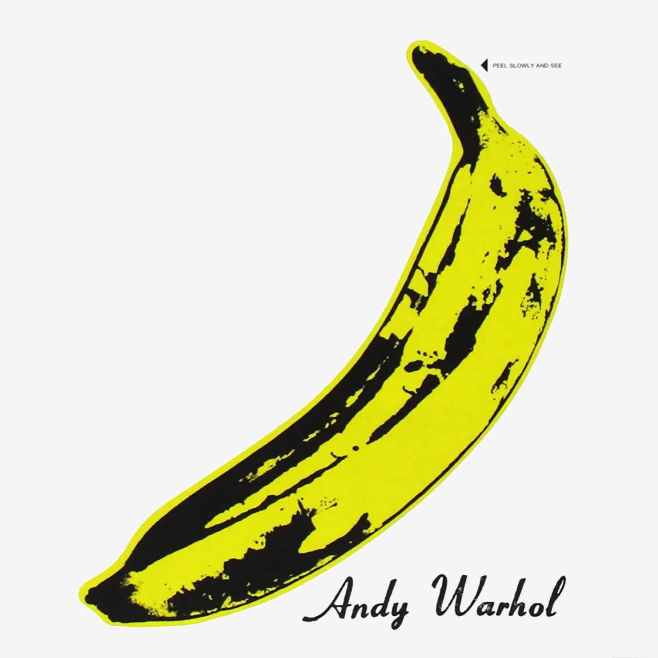
Andy Warhol, The Velvet Underground & Nico (album cover for The Velvet Underground and Nico), 1967.
Other landmark covers took very different approaches. Klaus Voormann’s illustrated collage for The Beatles’ Revolver (1966) combined drawing and photography in a dense, almost psychological portrait of the band. Peter Blake and Jann Haworth’s elaborate assemblage for Sgt. Pepper’s Lonely Hearts Club Band (1967) created an entire visual world, bringing together historical figures, cultural icons, and the musicians themselves. A year later, Richard Hamilton took the opposite approach with The Beatles, more commonly known as the White Album. Its nearly blank white sleeve, interrupted only by the band’s name and an individual serial number, made absence itself a visual decision.
What interests me about these examples is how differently they approach the relationship between image and sound. Some create an entire world around the music; others deliberately withhold visual information. Some are playful, some confrontational, and some almost anonymous. Yet each becomes part of the recording’s identity. The cover is no longer just something we recognize on a record-store shelf, it becomes something we carry with us.
By the 1970s, designers were treating the album cover as a place for more ambitious conceptual ideas. Hipgnosis, the partnership founded by Storm Thorgerson and Aubrey Powell, became known for surreal photographic imagery and unusual visual constructions. But one of the most interesting examples of their work, to me, is not a photograph at all. It is the cover for XTC’s Go 2, released in 1978.
The sleeve is almost entirely covered with text. It reads like an explanation of what an album cover is supposed to do: attract attention, identify the product, communicate information, and persuade someone to buy it. The cover is doing exactly what it describes. It explains its own function while performing it. The packaging becomes the ideational subject of the artwork.
There is something remarkably circular about that idea. The cover is both the object and the explanation of the object. It draws attention to the commercial purpose of album design while turning that purpose into a creative statement. It is a conceptual gesture that has always appealed to me because the idea is inseparable from the way the work is presented. The package is not merely carrying the artwork; it is the artwork.
Another important example is Peter Saville’s cover for Joy Division’s Unknown Pleasures (1979). Its series of white lines against a black background using a data plot of signals from a radio pulsar, transforming scientific information into an abstract composition. There is no band photograph or obvious reference to the music. Yet the image has become so closely associated with the record that it is almost impossible to think of one without the other. Its starkness, repetition, and sense of distance seem to belong to the atmosphere of the music. The relationship isn’t literal. It is something we experience.
For me, this relationship between music and visual art was never just an interesting cultural phenomenon. Album covers were a significant influence on my own development as an artist. Growing up, I spent as much time looking at the covers as listening to the records. Pink Floyd’s Wish You Were Here, The Dark Side of the Moon, and Animals were all important to me, as were Led Zeppelin’s Physical Graffiti, Houses of the Holy, and Presence. Studying their covers, along with so many others of that time, while listening to the music opened a world of conceptual thinking that I hadn’t encountered through the conventional paths of art history. I was beginning to understand that an image could carry an idea, that a record could become an entire visual and musical environment, and that the artwork surrounding the music could be as much a part of the experience as the songs themselves.
XTC, Talking Heads, Laurie Anderson, and The Smith albums were other major influences, particularly around the time I first moved to New York City. Those covers had an artistic intelligence and an unexpected relationship to the music that I found compelling. Even the seemingly simple cover for the Philip Glass soundtrack of Koyaanisqatsi, with its restrained typography and minimal presentation, stayed with me. It didn’t need to compete with the music or explain what was inside. Its simplicity was part of its power. Looking back, I realize how much I was learning from these records—not through formal instruction as I had in art school, but through listening, looking, and making connections. Album covers became an informal education in conceptual art, one that developed outside the usual chronology of museums, galleries, and art history books.
The album cover was also an object with a life beyond the record itself. It was handled, displayed, passed around, and sometimes put to entirely different uses. It wasn’t unusual to see someone using the album cover as a surface for separating seeds and stems before rolling a joint. The record would be playing while the cover was being put to work in another way. It was part of everyday life, not something reserved for careful observation. That physical relationship is something we’ve largely lost as music has moved from the turntable to the phone and computer screen.
As the boundaries between popular culture and contemporary art continued to dissolve, artists from the gallery world brought their own visual language to album covers. Takashi Murakami’s work with Kanye West on Graduation (2007) is a good example. His brightly colored, anime-influenced imagery brought his visual universe into hip-hop, connecting contemporary art, commercial imagery, and popular music. The cover was recognizable as part of Murakami's larger body of work, but it also belonged to the identity of the album.

Damien Hirst, I'm With You (album cover for Red Hot Chili Peppers), 2011.
Damien Hirst took a different approach with the cover for the Red Hot Chili Peppers’ I’m with You (2011), featuring a fly resting on a pharmaceutical capsule. It is a small, unsettling image that brings together medicine, mortality, beauty, and decay. Hirst has often explored the uneasy relationship between life and death, and those concerns are present here in a compressed visual form. The image doesn’t tell us what the music sounds like. It gives the record another layer of meaning.
I think the most interesting album covers are often the ones that don’t try to explain the music. They establish a relationship with it, sometimes through contrast, sometimes through a shared sensibility, and sometimes through an idea that neither the image nor the music could fully express on its own.
Before MTV, the album cover gave a recording its visual identity. It was a static visual companion to the music. You could look at it while the record played, return to it whenever you listened, and eventually associate the image with the fervent experience of the songs. Music videos later introduced movement, performance, and narrative into that relationship. But the album cover had already established something important: music could have a face before it had a moving image.
Charli XCX’s Brat (2024) brings this discussion back to the square, and in an unexpected way, back to Malevich. Its intensely bright green background and deliberately rough, lowercase, highly condensed typography is almost confrontational in its simplicity. The cover rejects the polished visual language traditionally associated with pop promotion. It is immediate, confident, and a little brusque. The visual attitude and the sound reinforce one another. The music is brash and energetic, but there is also vulnerability beneath that surface. The cover doesn’t describe all those qualities. It creates a visual identity that allows them to coexist.
There is an interesting distance between Malevich’s Black Square and Brat, both in their intentions and cultural circumstances. I don’t suggest they make the same statement, but both understand the power of reducing the visual field to a limited set of elements. A square can contain an enormous amount of meaning, even when very little is happening inside it. The image becomes a place where the viewer brings their own associations, just as music becomes something different to each person who hears it.

Brent David Freaney (Special Offer, Inc.) and Imogene Strauss, Brat (album cover for Charli XCX), 2024.
Perhaps that is why album covers have mattered so much to generations of listeners. They have introduced people to visual ideas they might not otherwise have encountered. A teenager buying a record may not know anything about conceptual art, modern painting, photography, or graphic design, but is already looking at it, absorbing images, compositions, typography, and ways of thinking about the world. Some of those listeners have, and will become artists themselves. Some images that once lived on record-store shelves now hang on museum walls. I don’t think the distance between those two places is nearly as great as imagined. Art doesn’t become meaningful only when it enters a gallery or museum. It can enter our lives in much less formal ways, and sometimes those encounters stay with us forever.
Art brings us into a space of thoughts and ideas. Music reaches us on a more physical level, igniting emotion and passion. When the two come together, something else happens. The visual language of art and the physical experience of music begin to inform one another, creating a dialogue that neither could achieve independently. This is the simultaneous contrast of art and audio: two distinct forms of expression, each changing the way we experience the other.
